Last updated: 2026-10-06
A resume looks like one page of plain text in a single column: contact block, a short professional summary, experience, skills, education, in that order, left-aligned in 10 to 12 point type. No photo, no sidebar, no icons. Layout carries weight because the file usually passes through applicant tracking software before a recruiter opens it, and plain single-column text is the shape that survives that step intact. Below: the six blocks rendered line by line, the top-of-page contact rules, number-first bullet syntax, twelve skills pulled from the posting, three formats compared in a table, and five formatting choices that get resumes dropped.
What is a resume, and what does one look like on the page?
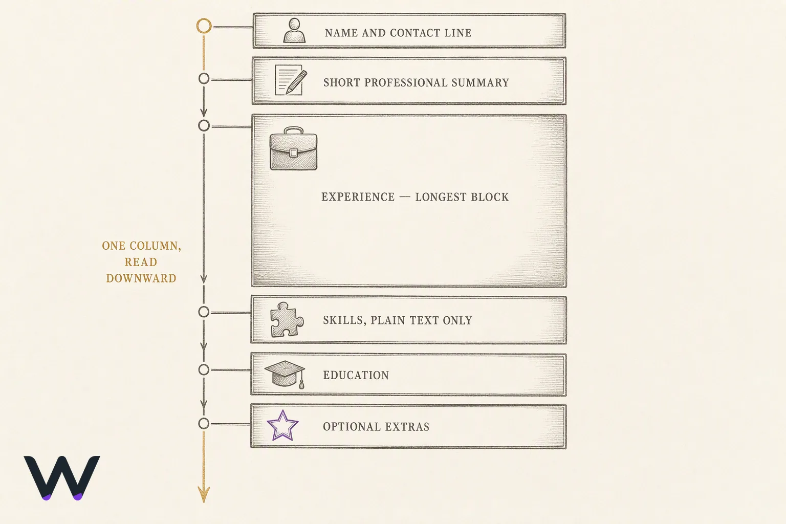
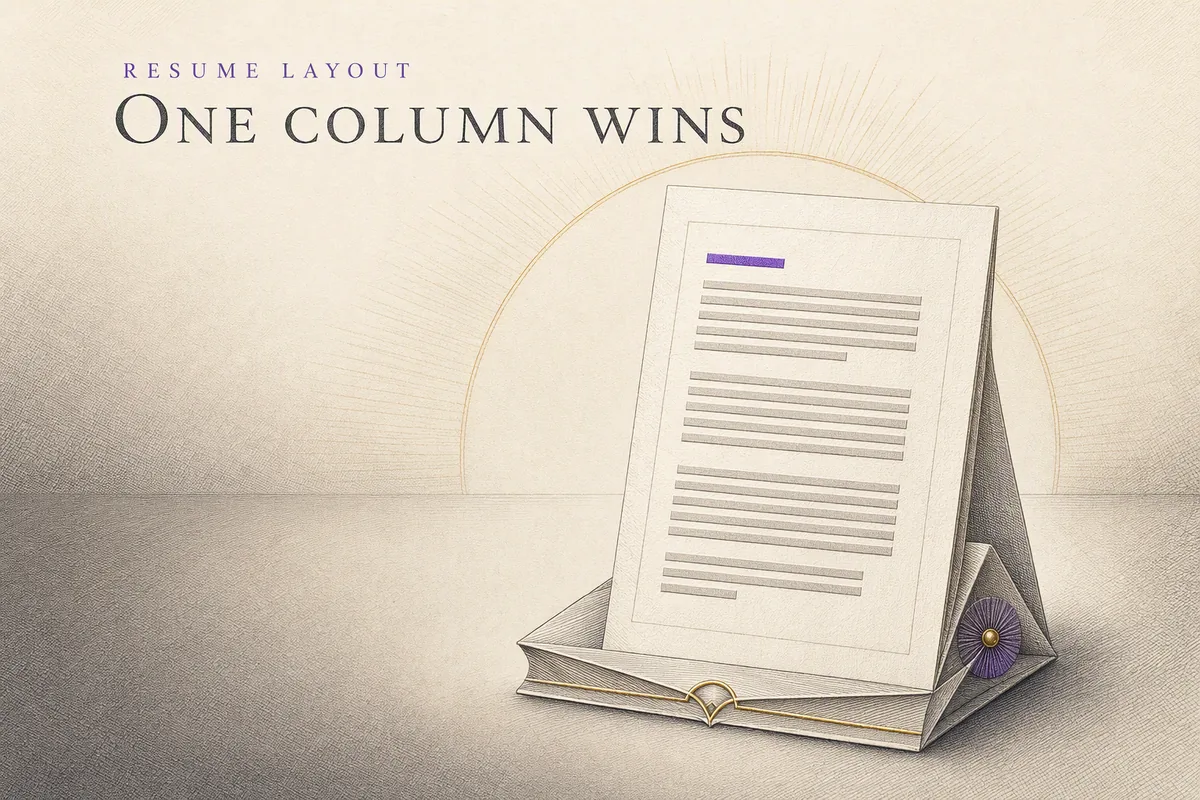
A resume is a one-page document listing your contact information, a short professional summary, your work experience, your skills, and your education, in that order. The format is plain text in a single column, left-aligned, 10 to 12 point body type, with section headings set in the same font as the body. No photo. No sidebar, no chart, no icons.
Six blocks, in this order: contact information at the top, then the summary, then experience, then skills, then education, then an optional extras block for certifications or languages. Contact information is one line under your name, holding city and state, email, phone, and one profile URL. Everything below it reads top to bottom in one column, because that is the only order a parser and a reader agree on.
Single column is the part people argue with. It is also the part worth holding. Two-column layouts put your job titles and your dates in separate reading streams, and the software that reads first has no reliable rule for which stream comes next. Experience is the longest block on the page and sits above skills, because the skills section is a keyword index for the work you already described, not a substitute for it.
One page, six headings, one column. That is the whole shape.
What changed by 2026: the screen reads your resume before a person does
In a 2026 survey of 463 talent-acquisition professionals across high-volume hiring industries, 75% of employers said AI has already reduced recruiter workload, and the same respondents ranked resume or profile screening a top priority for their next AI investment in hiring [1]. Lighthouse Research & Advisory ran that survey with the applicant tracking system vendor iCIMS, in healthcare, manufacturing, retail, hospitality, transportation and construction. It does not measure the general labor market.
Two limits are worth stating plainly. The vendor whose own category the survey measures also published it, so discount it the way you would any vendor measuring itself. And it says nothing about what share of your own applications a machine reads before a person does. No credible public figure answers that, and anyone quoting you a precise percentage for it is quoting a guess. What survives those limits is narrow and still useful: among employers who hire in volume, screening is where the automation budget is pointed.
The practical consequence is a formatting rule, not a keyword trick. Applicant tracking systems read text in document order, so the choices that scramble that order are the choices that cost you: two columns, a skills sidebar, contact details pushed into a header or footer, a job title rendered inside a text box, a skill bar graph instead of the skill's name.
Plain text in one column survives both readers. Keyword optimization then means writing the employer's actual words into your experience bullets, where a hiring manager will also read them, rather than hiding a keyword list in white text at the bottom of the page. That last trick still circulates. It fails the human step instead of the software step, which is worse.
A full one-page resume, rendered line by line
A simple resume is six blocks of plain text in a fixed order, fitting on one page in 10 to 12 point type. The resume below is a hypothetical composite written as a teaching example: the name, employers and figures in it are invented, and only its line structure is the lesson.
JORDAN REYES
Chicago, IL | jordan.reyes@email.com | 312-555-0148 | linkedin.com/in/jordan-reyes

SUMMARY
Customer support specialist, 4 years in B2B software. Owns escalation
queues and writes the help docs that retire them.

EXPERIENCE
Support Lead, Northwind Logistics                        2024 - Present
- Handle 60 escalations a week across billing and onboarding tickets.
- Rewrote 18 help-center articles; deflected repeat billing questions.
- Train 3 new agents per quarter on the escalation runbook.

Support Agent, Northwind Logistics                        2022 - 2024
- Resolved 40 tickets a day in Zendesk across billing and account access.
- Built the macro library the team still uses for refund requests.

SKILLS
Zendesk, Jira, Intercom, SQL (basic), technical writing, Spanish (fluent)

EDUCATION
BA, Communications, University of Illinois                        2022
Copy the line structure, not the content. The rules it follows:
- Name line: your name alone, the largest text on the page, nothing beside it.
- Contact line: city and state, email, phone, one profile URL, separated by pipes, one line only.
- Section headings: all caps, body font, one blank line above each, no horizontal rules.
- Job lines: title and employer on the left, dates on the right, identical pattern in every entry.
- Bullets: three per recent role, two per older role, each starting with a verb, wrapping to two lines at most.
- Skills: one comma-separated line of tool and language names, no ratings and no bar graphs.
- Education: last, one line per degree, dropped to a single line once you have work history.
The visual design is the white space those rules produce, and nothing else. Blank lines between blocks, a left margin that never moves, and a page that ends before it runs out.
Open your current resume, delete every element this example does not contain, and see whether it still fits on one page with room left over.
What should a resume look like at the top: contact block and resume summary examples
The top block is four lines, and every line past the fourth is taking space from your experience. Name on its own line, set larger than anything else on the page. Underneath it, one line carrying city and state, one phone number, one email address, separated by vertical bars. No street address, no photo, no date of birth, no marital status. A photo adds a graphic where a parser expects text, and the rest is information no one asked for.
Keep the top block to these fields:
- Full name, spelled the way you want to be addressed in the interview.
- City and state, or city and country. Street address omitted.
- One phone number, the one you actually answer.
- One email address at a plain domain, formatted firstname.lastname.
- LinkedIn URL with the custom handle, not the default string of digits.
- Portfolio link only when the work behind it is public and finished.
Directly below sits the professional summary: three lines, no heading ornament, written as fragments with the "I" dropped. It names what you are, what you have done, and what you want next. Both examples below are hypothetical, written to show line shape only.
Entry-level (hypothetical): "Accounting graduate with two internships in accounts payable and a working knowledge of NetSuite. Reconciled vendor statements and cleared aged invoices under a controller's review. Seeking a staff accountant seat on a close-driven team."
Mid-career (hypothetical): "Operations manager, warehouse and last-mile, currently running a shift of thirty at a regional 3PL. Rebuilt pick paths and cut overtime without adding headcount. Targeting a site lead role."
Rewrite the summary for each posting. That is the one block on the page worth retyping every time, because it is the only block a human reads before deciding whether to read the rest.
Write the experience bullets as number-first sentences
Every experience bullet follows one syntax: action verb, object, measured result. "Renegotiated three carrier contracts, cutting freight spend by eleven percent over two quarters." Verb first, no "Responsible for", no "Helped with". The object is the thing you touched. The result is what changed because you touched it, stated in a unit a stranger can picture: money, time, headcount, error rate, volume, retention.
When the job attached no metrics to your work, you still have a number. Count something you did.
- Volume. Tickets closed per week, invoices processed per month, classrooms covered.
- Scale. People trained, accounts owned, square feet managed, systems supported.
- Time. Turnaround before and after, hours saved per cycle, days cut from a close.
- Money. Budget administered, spend reduced, revenue touched even if not owned.
- Range. Years on the tool, shifts run alone, languages supported.
Pick the honest count and write it. "Handled forty to sixty support tickets a week at a two-person help desk" is a measurement. "Provided excellent customer support" is a mood.
The three don'ts of resume writing, in the order they cost you interviews. Do not write duties where a result belongs, because a duty list describes the job and not you. Do not pad with adjectives like "detail-oriented" and "hard-working", because the reader skips them and the posting never asked for them. And do not lie about dates, titles, or numbers, because every one of the three is checkable and a single caught inflation ends the application.
Employment gaps are a date problem, not a bullet problem. Use years rather than months on older roles to flatten short gaps honestly, leave the long gap visible, and name it in one line of the cover letter instead of hiding it with a stretched end date. Stretched dates are the kind of detail a reference check surfaces. A stated gap rarely is a problem.
Rewrite your three most recent bullets tonight. If none of them contains a count, you have found the weakest page on your desk.
Resume skills examples: pick the twelve that the job posting names
Cap the skills section at twelve entries and take every one from the posting's own wording. Business operations skills, the category covering customer service, administrative, and HR work, appeared in nearly three-quarters of all US job postings in Q4 2025, more than any other category in Indeed Hiring Lab's analysis of its own US postings [2]. That is the category most likely to supply the exact phrases a scanner is matching, so copy the posting's noun rather than your preferred synonym: "accounts payable", not "AP work".
Build the twelve like this:
- Tools you can open tomorrow: Microsoft Excel, Salesforce, QuickBooks, Adobe Illustrator.
- Named methods and systems: double-entry bookkeeping, SQL, lean manufacturing.
- Certifications with issuer and status: CompTIA Security+, held and current.
- Languages with a plain level: Spanish, professional working proficiency.
- Posting phrases you genuinely match, lifted verbatim from the job ad.
- Nothing else. Twelve is the ceiling, not a target to fill.
Skill bars and five-star ratings cost you matches twice. A graphic carries no text for a parser to match, so the skill can drop out of the comparison entirely. And a human reads your self-assigned four-out-of-five as a number you made up. Delete them. Use plain text.
Soft-skill adjectives belong in the bullets, not the list. "Team player" and "strong communicator" are claims with no evidence attached; the same quality shown as "trained eleven new hires on the dispatch system" is evidence with no claim needed. Hard skills in the list, soft skills demonstrated above it.
Open the posting, highlight every tool and named method in it, and keep the twelve you can defend in a follow-up question.
What does a good resume look like next to a bad one: three formats compared
Three layouts cover nearly every resume a job seeker will build: reverse chronological, functional, and hybrid. The table compares them on how reliably a parser reads the file, which career stage each one fits, and what a recruiter reads into the shape before reading a word.
| Format | How parsers read it | Career stage it fits | What it signals |
|---|---|---|---|
| Reverse Chronological | Safest: employer, title, and dates sit where parsers expect them | Continuous, relevant work history | Steady progression, nothing hidden |
| Functional | Riskiest: skill clusters leave job dates unanchored to employers | Long gaps or scattered freelance records | Gap management, which many recruiters read as a flag |
| Hybrid | Safe when a short skills block sits above an intact dated history | Career changers entering a new function | Transferable skills with the record still visible |
Use Reverse Chronological unless you can name the reason you are not. Functional is the overrated one: it reads as concealment to a recruiter, and it strips a scanner of the employer-date pairs it needs to build a timeline. Career changers get more from Hybrid, where a six-line skills block does the tailoring work and the dated history underneath stays verifiable.
One naming point, because the two words get swapped. A CV is the long, cumulative academic record listing publications and teaching; a resume is the short, targeted document a hiring manager skims. Tailoring is a resume habit, not a CV one. If a posting in the United States asks for a "CV" and the role is not academic or research, send the resume.
Five formatting choices that get resumes dropped
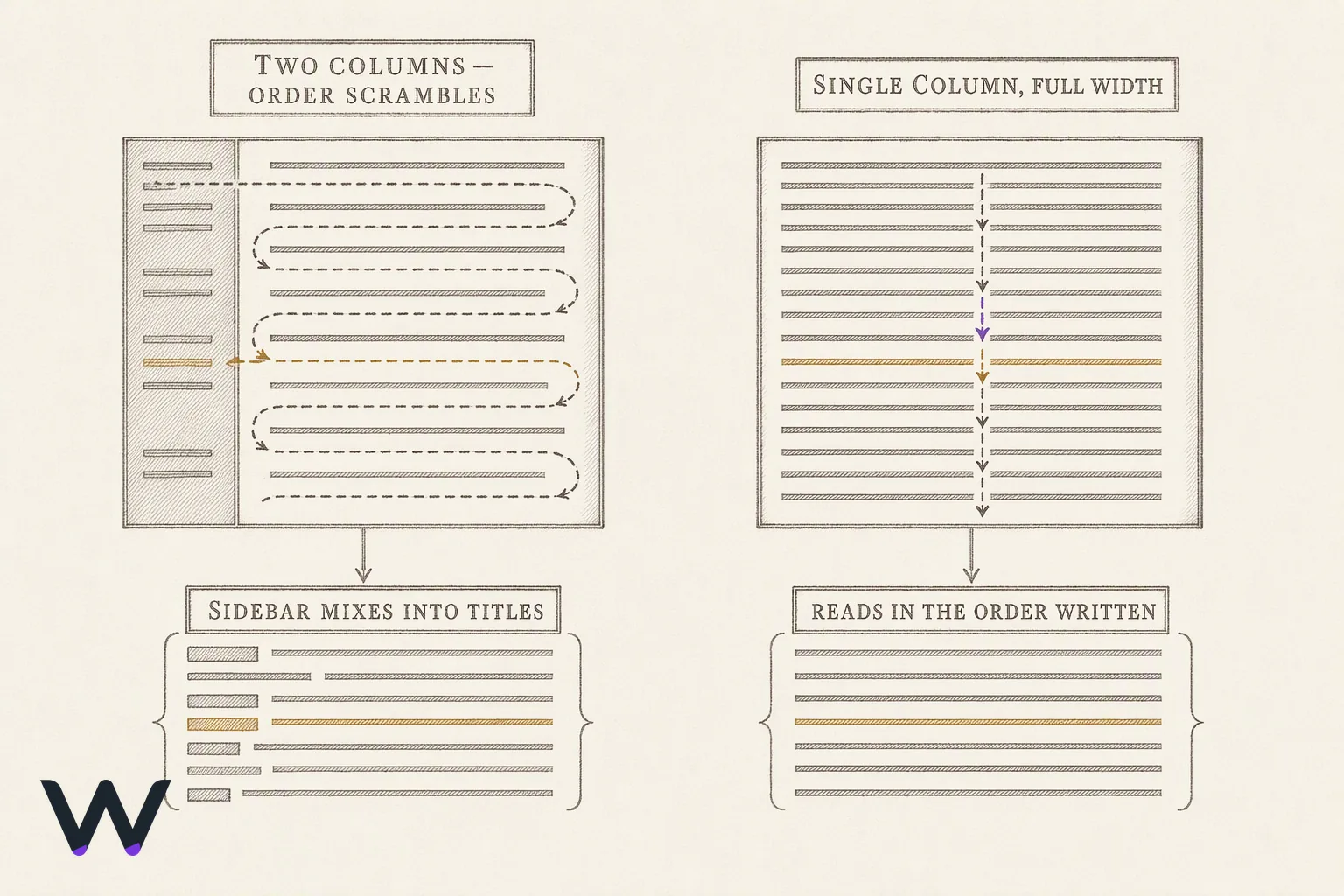
Five mechanical choices put your resume at risk before a human reads it, and each has a one-line fix.
- Two-column layouts. A parser that reads left to right across the full page width interleaves the sidebar with the main column, and your job titles land inside your skills list. Fix: single column, full width.
- Contact details in the header or footer. Header and footer text sits outside the document body, and nothing guarantees that a given upload form or parser pulls it in. That puts your phone number and email on the one part of the page you cannot afford to lose. Fix: put name, email, phone, city, and LinkedIn URL in the body's first four lines.
- Tables for layout. Table cells carry the same reading-order ambiguity as columns, and a parser that flattens a table can hand the whole thing over as one blob. Fix: plain paragraphs and hyphen bullets.
- Invented section names. "My Professional Journey" and "Where I've Been" give a keyword scanner nothing to index. Fix: use the standard headings — "Experience", "Education", "Skills".
- A scanned or image-based PDF. A photographed or scanned page carries no selectable text, so there is nothing to extract. Fix: export a text PDF from your editor, check you can select the words in a viewer, and keep the file under a megabyte for upload forms.
Two more things worth the minute each. Save as PDF rather than DOCX unless the form asks for DOCX, because PDF holds spacing across every reader. And read the final file aloud once: a typo in your own job title survives every spellchecker, since both words are spelled correctly.
Frequently asked questions
How do I write a simple resume?
Write a simple resume in one column with five headings: contact details, a two-line summary, Experience, Education, Skills. Each experience entry gets employer, title, dates, and three bullets that open with a verb and end with a result. No photo, no graphics, no sidebar. Draft it in a plain document editor and export to PDF.
What is the format of a resume?
A resume's format is a single-column, reverse-chronological page: name and contact details at the top, then a short summary, then Experience with the most recent job first, then Education and Skills. Standard heading names, consistent date style, one typeface in two sizes, and margins no tighter than half an inch.
How many pages should a resume be?
One page suits most applicants, and two pages are defensible once you have a decade of relevant history to account for. Harvard College's career-services resume guide sets no page rule at all, instructing students instead to "List headings (such as Experience) in order of importance" and to order entries within each heading in reverse chronological order [3]. Priority beats page count.
What are 5 common mistakes people make on their resume?
The five that cost interviews: a two-column layout a parser cannot read in order, contact details stranded in the page header, invented section names, a scanned image PDF with no selectable text, and the same generic bullets sent to every posting. Each one is fixable in under ten minutes.
What are three don'ts to resume writing?
Do not list references or write "references available on request" — a hiring team asks when it needs them. Do not include a photo, birth date, or marital status for United States applications. And do not claim a duty or a result you cannot describe in a follow-up conversation, because the interview is where that gets checked.
References
- ICIMS and Lighthouse Research Find 75% of High-Volume Employers Say AI Reduces Recruiter Workload — icims.com
- Skill Set, Match — indeed.com
- Harvard College Guide to Creating a Strong Resume — harvard.edu

Stop applying. Start interviewing.
- ✓Wobo finds matching roles and applies for you
- ✓Tailored resume, cover letter and answers included
- ✓You focus on interviews, we handle applications